Contents Page Construction Examples
 At first I tried a different approach with my title. I thought having the title down the side of the page might look more interesting.
I then decided that having the title down the side of the page looked less proffesional so I moved it to the top left side.
I then began to test out different images and fonts. This image of Kate looked quite dull and blurry. It didn't stand out against the red and white text, so I soon decided not use it.
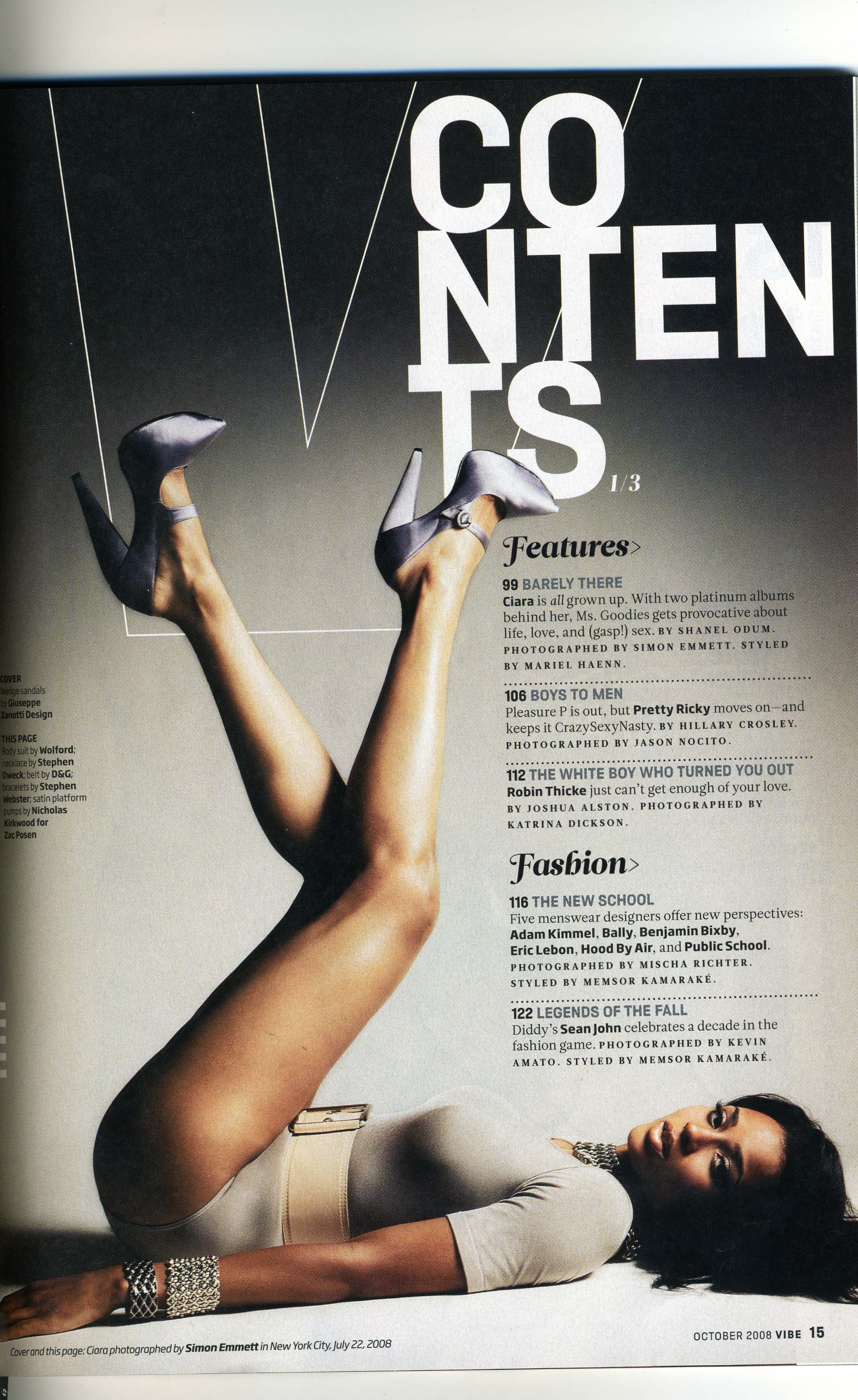
I decided to use a black and white image, in order to tie my contents page in with my front cover. This image stands out alot more than the 1st one did.
I used a colour image at the bottom to give the magazine some colour and variety. I coloured around the models with a black brush tool on Adobe Photoshop CS4, in order to make them stand out more, and make the image alot more fun.
I played around with the font for my title. I decided instead of using different colours, I would just play around with the font. I made some letters slightly bigger than others, to make the title look more exciting, without too much going on.
Once I had placed my images, I worked the text around them. Using red for the numbers and sub-headings added colour to the page, without being too bold and overwhelming.
I found that in most magazines the contents page font is usually quite small, so i tried to recreate this technique, and used two small collumns to balance out the images on either sides of the page.
 This is the original photo i have taken.
  This is the image manipulated. I have used a photoshop filter called 'watercolour'. It has enhanced the colours in the image, and now looks like a painting.
  This is my original photo. It is a close up of her face, however the colours are not very vibrant.
  I have manipulated the image by adjusting the brightness and contrast. This creates more of a contrast between the light areas and the dark areas which makes the image stand out a lot more. It emphasises the colours.
  After adjusting the brightness and contrast, i then made the image black & white. This makes the image less vibrant and creates a different, effect. It is more calm and classic.